


新宿 北村写真機店
新宿駅東口にオープンした「北村写真機店」のアートディレクション、ロゴ、パッケージ、サイン計画を担当しました。
「主役であるカメラの邪魔をしないデザインにする」ことを念頭に置きながら、VIを考えました。
ロゴタイプ:
ロゴマークは、全体のイメージの旗頭となる重要なものだと考えて制作しました。カメラの原型であり、今回のプロジェクトのコンセプトである「カメラ・オブスクラ(ラテン語で「暗い部屋」の意味)」の図を見ると、外側から光が入りピンホールを通って内部で画像が定着する仕組みが描かれています。
この光のラインをベースにラフを描き、北村の頭文字の「K」になるのではないかと思いました。そこで、真ん中のタテ棒をレンズをイメージして少し湾曲させてマークにしました。
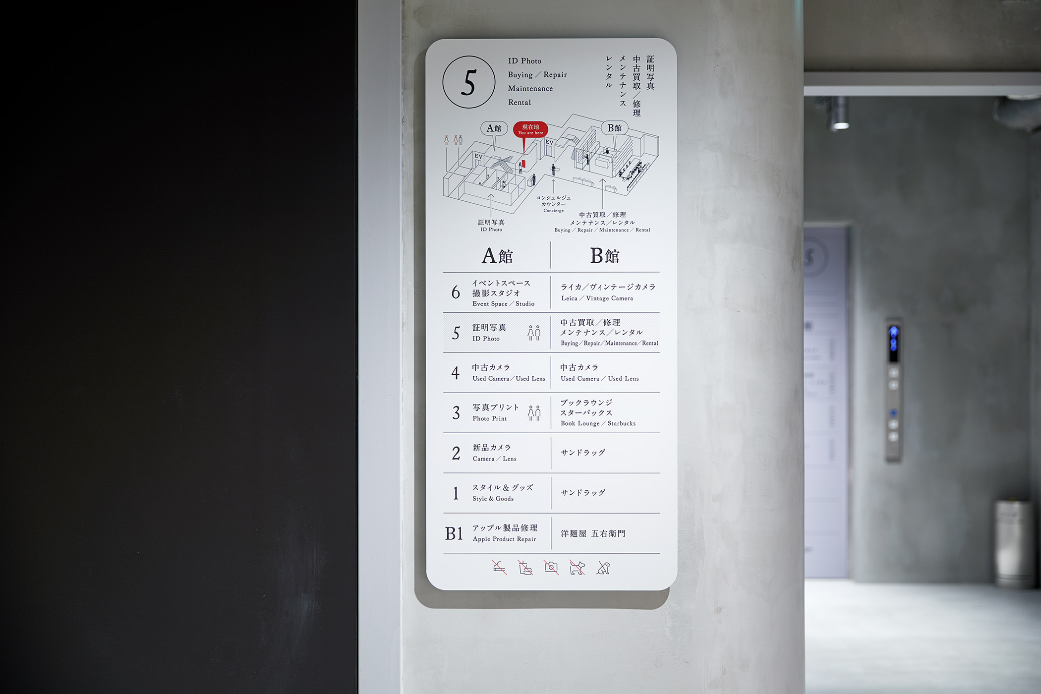
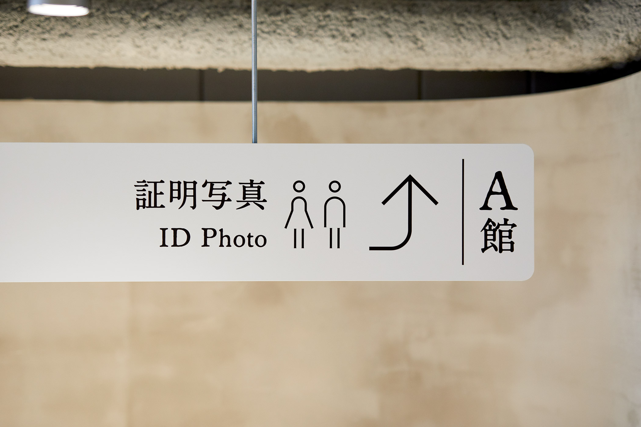
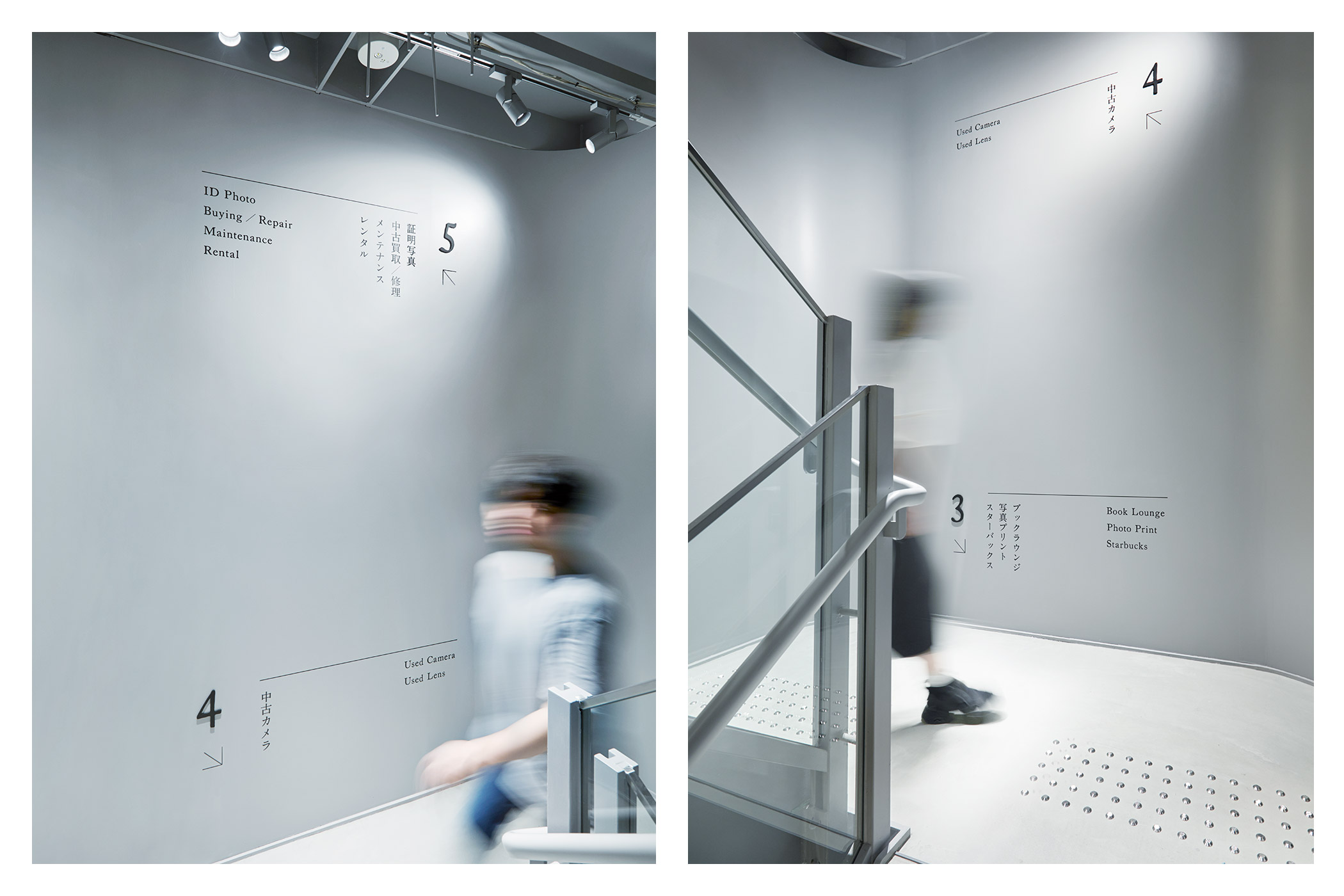
サイン計画:
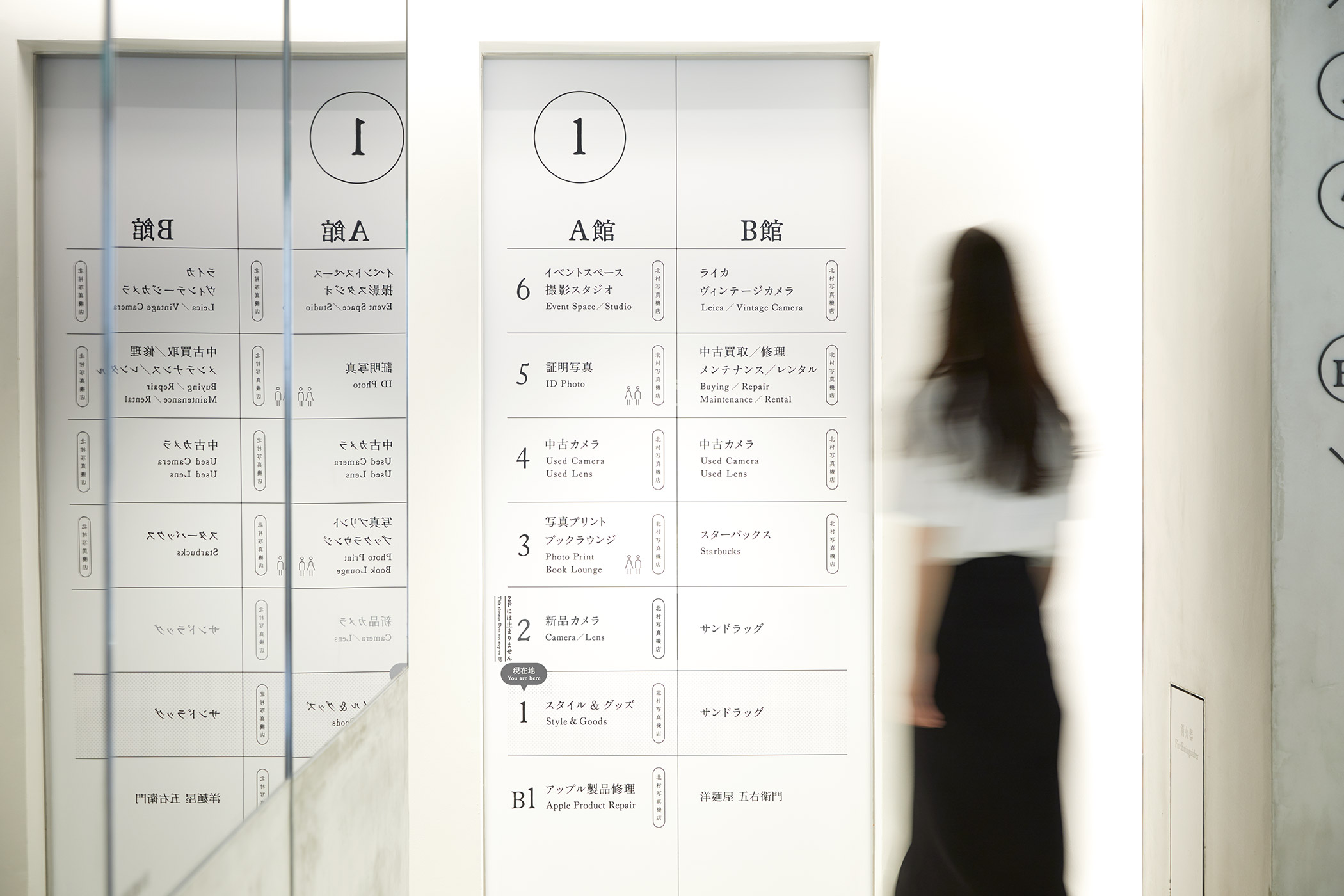
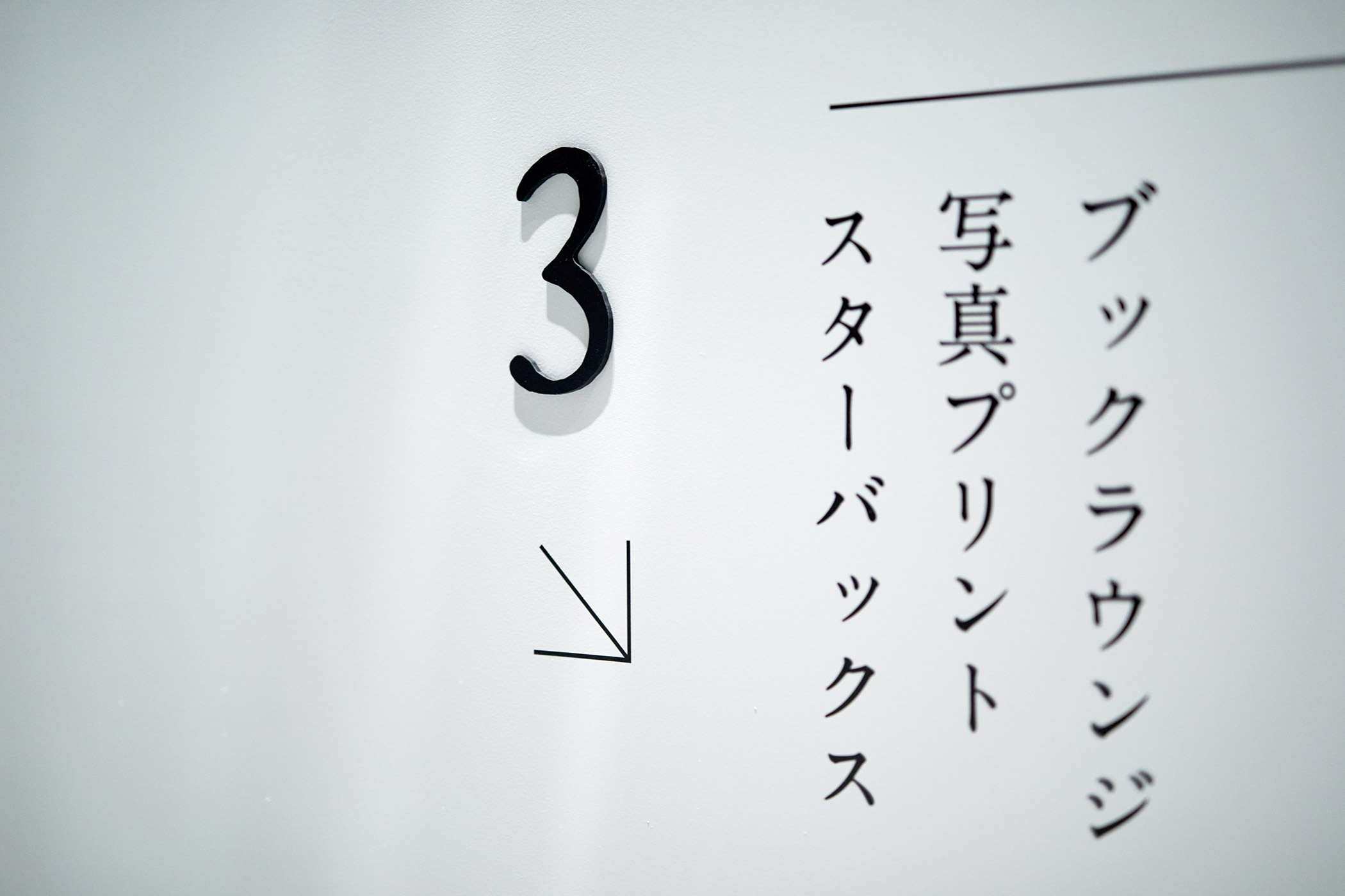
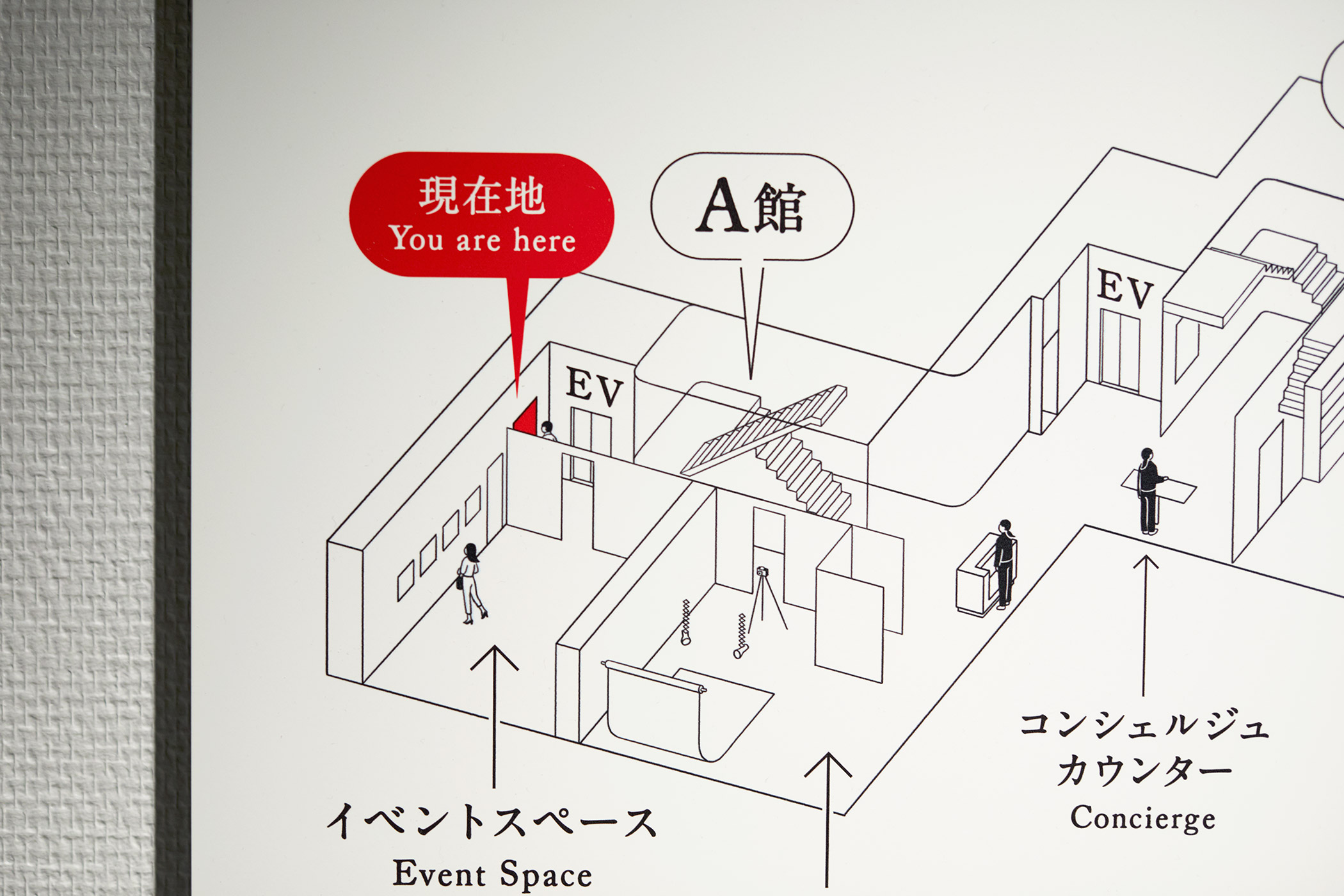
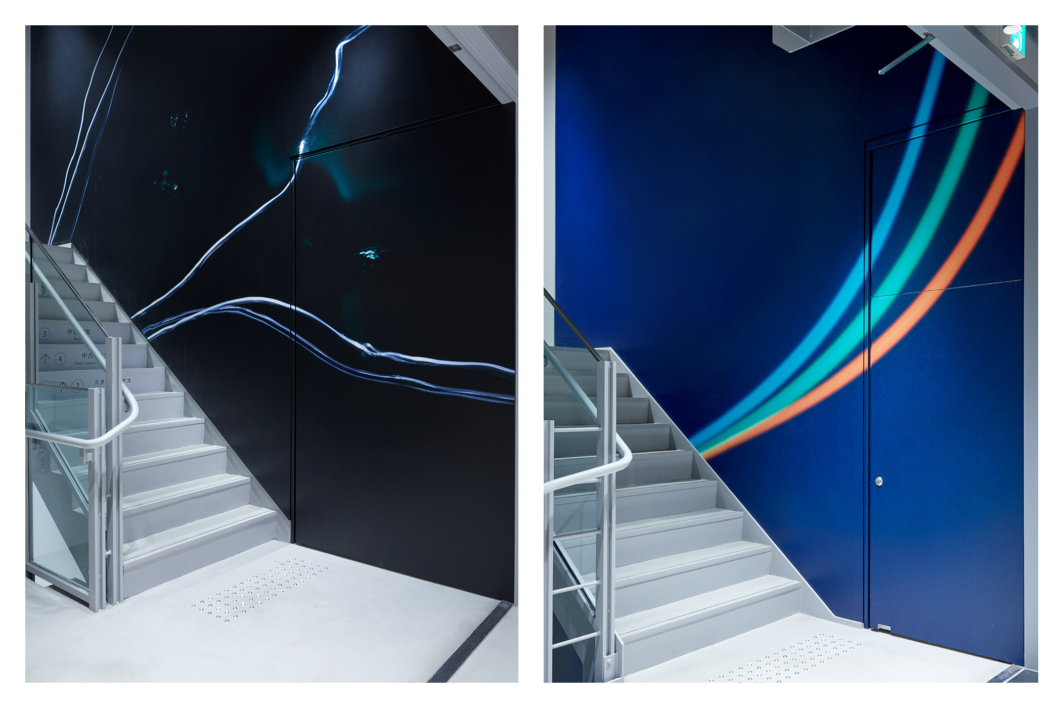
A館とB館の2棟がつながってできている建物内の、ワンフロアそれぞれが細切れになっている空間に対して、フロアによって「撮る」「残す」「治す」といった、店舗の形態が異なる複雑な構成になっている構造を整理するようにサイン計画を考えました。
1階には全フロア分のマップを置き、そのほかのサインもエレベーターの扉や、階段をあがった目線の先など目にとまる場所に置くことで、空間の邪魔をせず、かつ目的地にスムーズにたどりつけるように工夫しています。
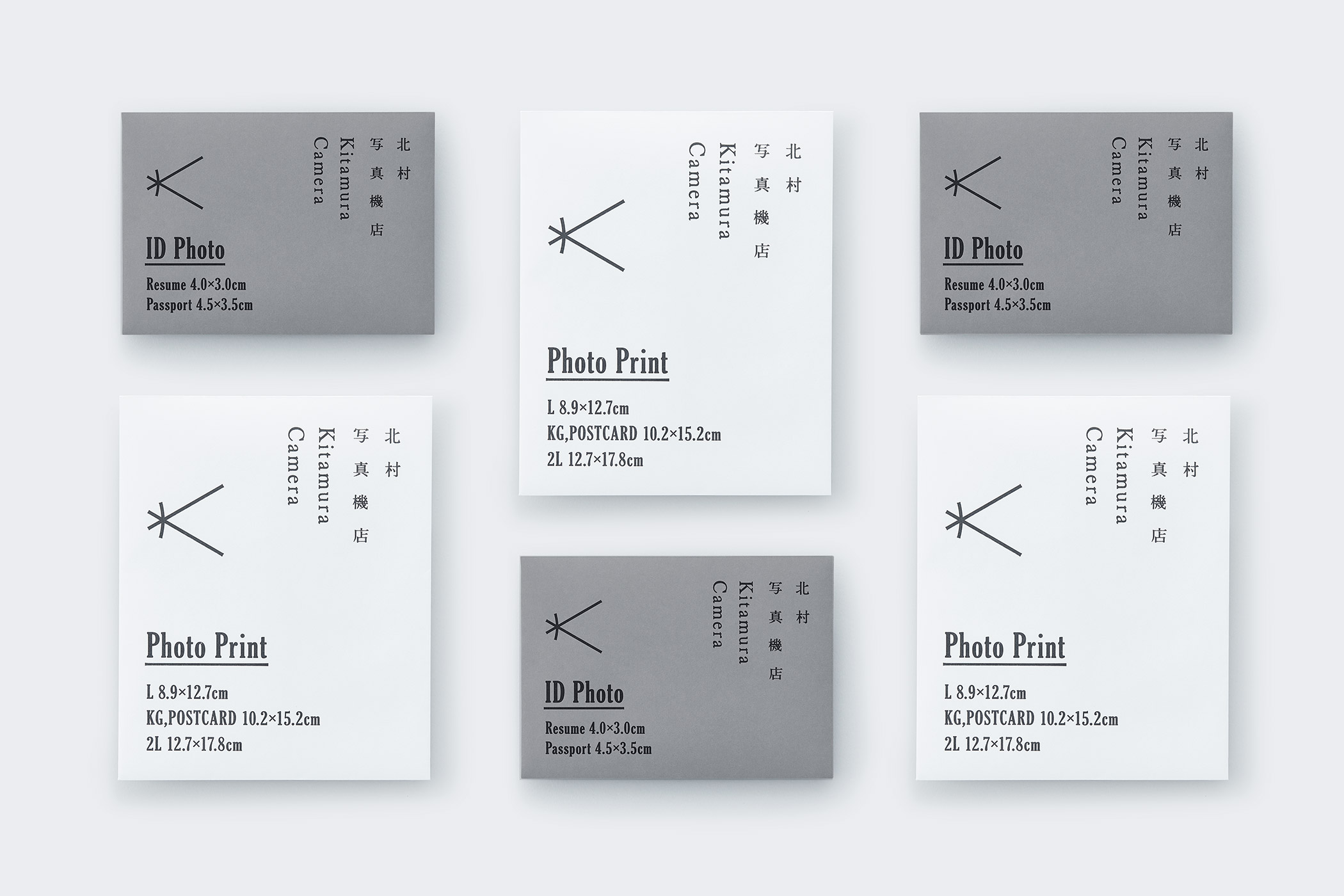
ショップアプリケーション:
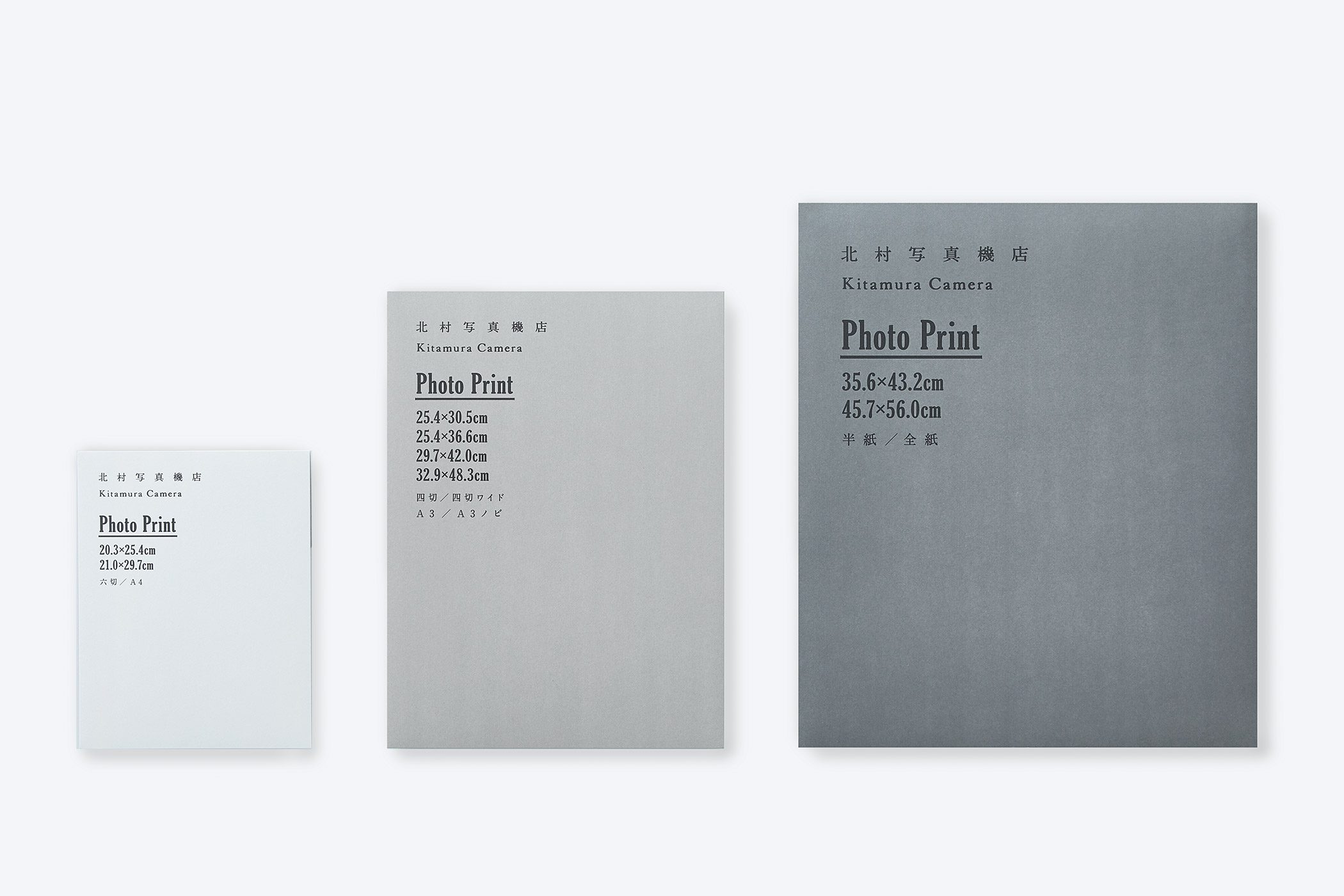
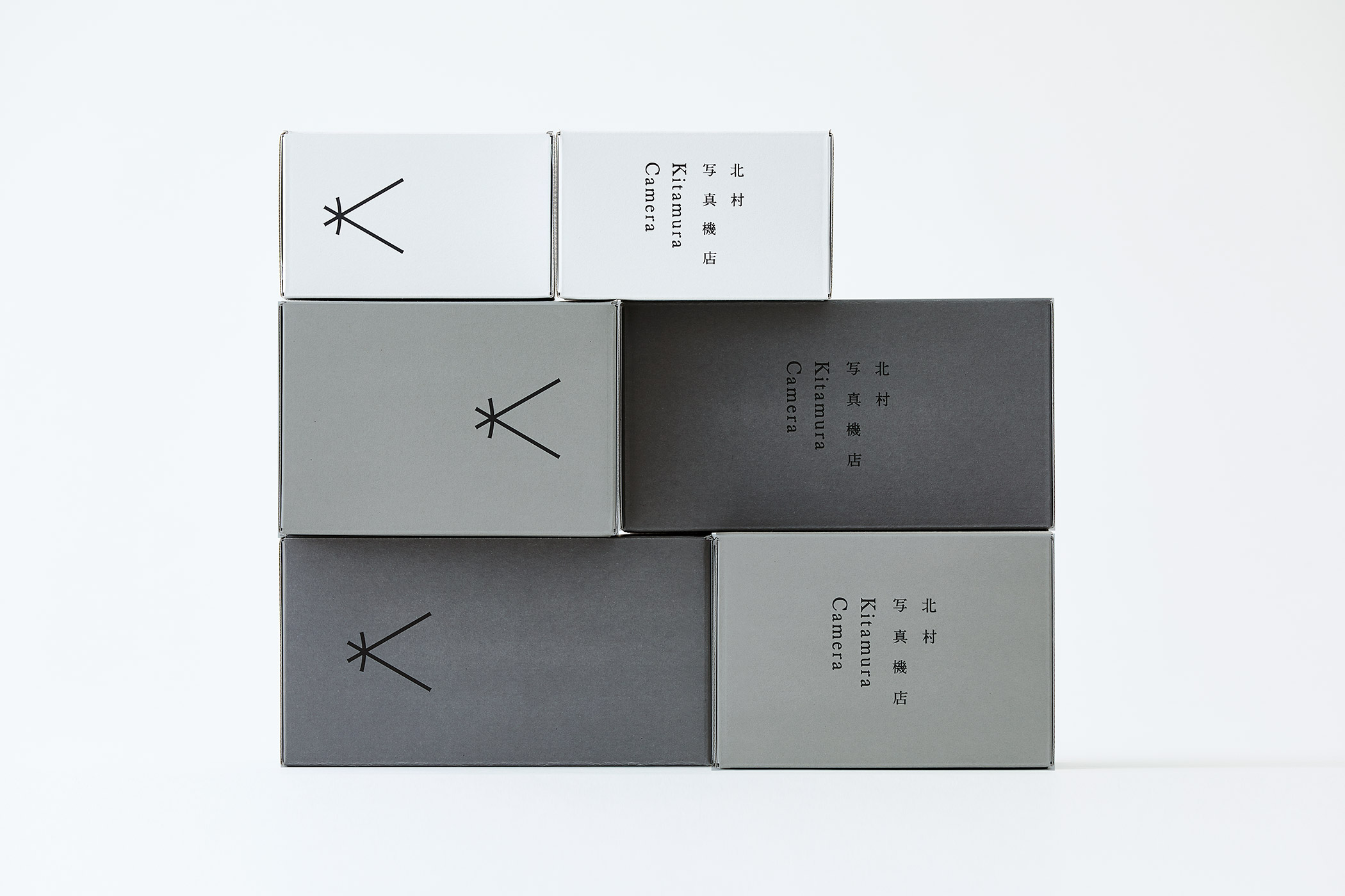
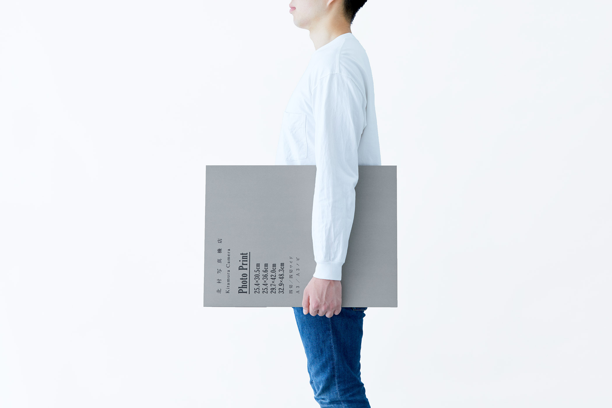
TONERICO: INCによるデザインである空間のキーカラーであるグレーをベースに、フォトケースやショッパーなどのアプリケーションを考えました。
空間を見ると、1階と2階が明るい白で、上にあがっていくとライトグレー、そしてカメラの黒という印象が残った。そこで、各アプリケーションも1色だけではなく、3色で構成することにしました。
また素材は、地券紙というグレーの再生紙を白く刷るなどして加工し、質感を高める工夫をした。
建物がざっくりとしたスケルトンの部分を見せて高級になりすぎないよう「抜け感」を出しているように、紙でも新聞紙のような素材を上品に扱い、建物をそのままデザインで表現するようなつもりで考えました。
For the “Kitamura Camera Shop” which opened at the east exit of Shinjuku Station, I was appointed for its Art Direction, Logos, Packaging, and the Signage Designs.
I had thoughtfully considered its visual identity whilst bearing in mind that, “design shouldn’t interfere with the main role of a camera”.
Logotype:
The logo was created with the understanding that it would play an important role for its overall flagship image. Considering the “Camera Obscura” (or “dark room” in Latin) where light enters from the outside and through a pinhole the image is fixed within, it is the essence of a camera and the concept for this project.
I initially drew rough sketches based on the lines of light, and by bending the vertical bar a little in the middle to resemble the image of a lens, there is an overall resemblance to the letter “K” for Kitamura.
Signage:
Furthermore, the building comprising of Building A and Building B is fragmented on different floor levels, and were formatted for “collections”, “drop-offs”, and “processing” etc. Therefore a signage plan was devised to organise the various complex functions and identities within the store.
Maps displaying the functions of all floors are located on the 1st floor with further signage placed on locations which are clearly noticeable, such as the elevator doors and to lines-of-sight as you reach up the stairs. In so that all spaces can remain undisturbed, whilst maintaining smooth passage to each destination.
Shop Application:
Furthermore, the building comprising of Building A and Building B is fragmented on different floor levels, and were formatted for “collections”, “drop-offs”, and “processing” etc. Therefore a signage plan was devised to organise the various complex functions and identities within the store.
Maps displaying the functions of all floors are located on the 1st floor with further signage placed on locations which are clearly noticeable, such as the elevator doors and to lines-of-sight as you reach up the stairs. In so that all spaces can remain undisturbed, whilst maintaining smooth passage to each destination.